LOC Credit Union
A lively rebrand for a credit union with a heart for community.
LOC Credit Union has a passion for helping their members achieve their goals and dreams. Eager to attract new and younger members to their three Michigan branches, LOC approached Phire Group in need of a rebrand that would garner increased interest in their many personal services and business solutions. Simultaneous to the rebrand, all LOC locations would be receiving a facelift that would need to feature aspects of the new identity to bolster impact within their physical branches.
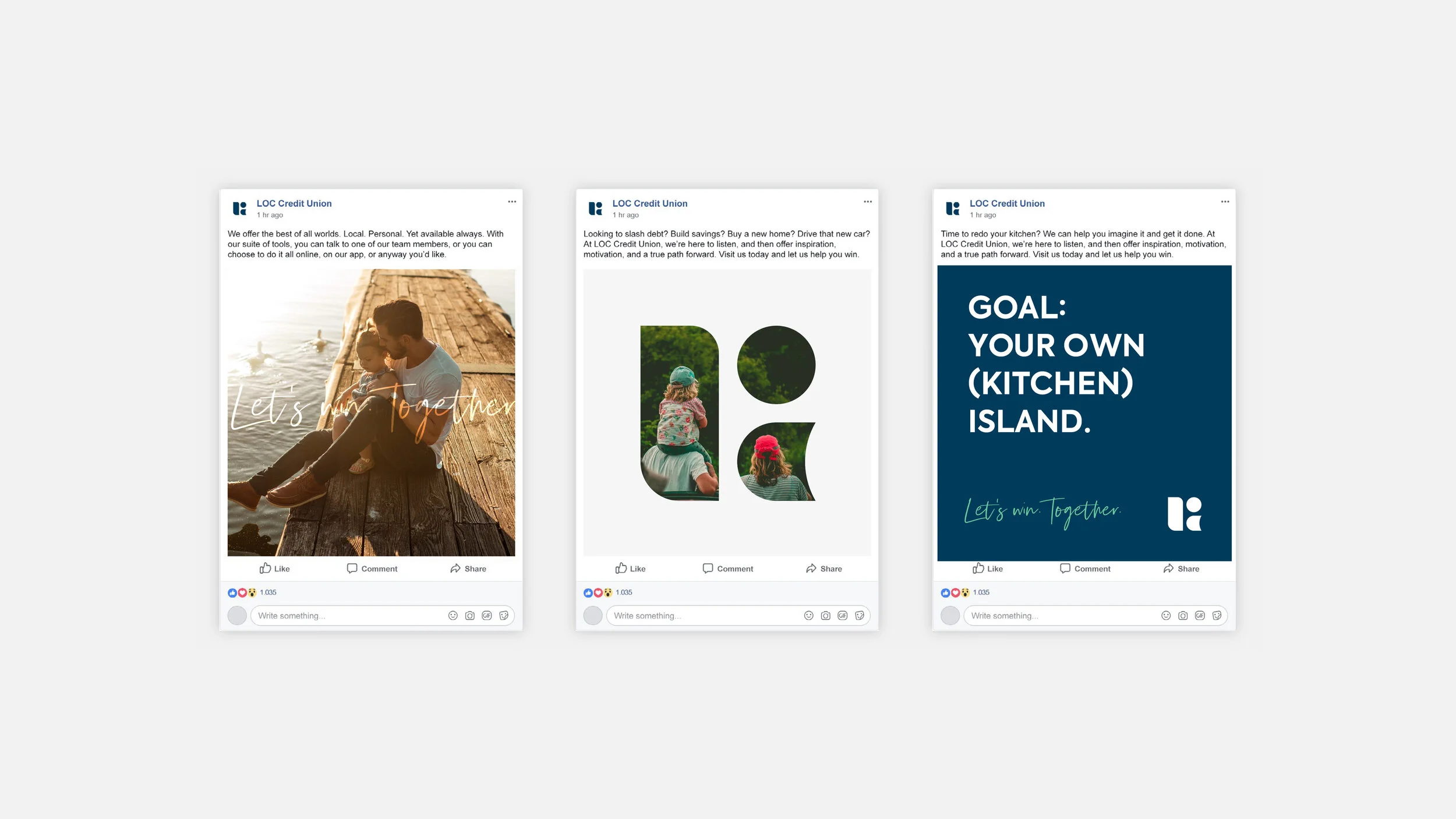
The final solution is a modular grid of shapes that represent the three communities that the credit union serves, and also the letters of the ‘LOC’ acronym. Within the larger system, the repeated shapes are used to mask photography, frame content, and highlight information. The vivid color scheme and contrasting font pairing allows flexibility whether sharing digital or print communications. The overall brand impact is a lively, modern update and one that is posed to welcome new members through LOC’s doors no matter their age, goals, or need.
Output
Brand Identity
Brand Standards
Collateral
Video Storyboarding
Credit
Designed at Phire Group
Creative Direction/Collaborator:
Kurt Keller
Motion Graphics:
Mike Fortunato
Copy:
Jim Hume
Storyboard design for brand video


